- What the F**** was that?
-
Windows 8.1 (Blue) coming - a kind of SP1 for 8, only better
I'm actually looking forward to 8.1. I'm a desktop user and in 99% of time I don't use or need Metro Start. I've set a couple of tiles I thought I might find handy but... Nope, always going directly into desktop. Already tried a few tips and tricks on how to boot directly into desktop (sadly with mediocre results) but.. I know this is not it. Other than that, I don't really miss the start button Or log out/turn off buttons, for that matter because Alt+F4 solves it for me. I also read somewhere that Win8.1 will be offered as a free upgrade from Win8 but not from Win7.
-
Can't run MSI installers
I hope it isn't too late but here are a few options/solutions: 1) run software in compatibility mode (try Win XP SP3) and/or as administrator 2) create new user and log in through it 3) log in as administrator: open Command Prompt as admin (right click -> "Run as Administrator"), type net user administrator /active:yes log out and log in as administrator Good luck with it.
-
My Personal Image Integration Process
I'm just here to say that you're doing a fantastic work, something most new users/members will find useful Keep it up, guys.
-
Is there a tool lite windows 8?
I finally got my hands on Windows8 (days away before their cheap offer is about expire), almost didn't make it due to their upgrade assistant problems I'm looking forward to experimenting with WTK. On one hand with 8's release I expected the 8 forum to burst with questions, ideas and solutions but on the other one, 7 and 8 are kind of alike. Kind of.
-
MediaFire Account Suspended.
Sorry to hear that, Lego. I actually love Mediafire as to me are one of the most reliable store-and-download sites. Never thought they'd be making problems to users through Asian porn sites. Heh.. Hope it all gets sorted out soon.
-
Update list while updating, black bar(s)
I'm using integrated Intel card so I assume it has something to do with it. But, as I said, the v34 does behave better than latest stable so you must be doing something right
-
Update list while updating, black bar(s)
Actually I was referring to latest stable version Anyway, downloaded v34 minutes ago, fired it up and downloaded a few updates just for the hell of it (I keep beta in different folder so it wasn't crashing with updates downloaded with stable version). So, during the download black bars showed up and again stayed after the download finished. However, the tick boxes worked ok. I didn't download all of the updates to see if the bar was moving/resizing properly this time (my connection is not as fast as I want it to be, besides my bandwidth is currently ummm.. "busy"). Also, after the window restart all buttons and tick boxes showed up normally and worked normally. So all-in-all, v34 is an improvement from the stable when it comes to this black bars problem.
-
200,000 Downloads
Insane numbers for such a small-ish site Next goal: 500k downloads. LET'S DO THIS!
-
Sort By.. option under updates
Nah, I (used to) keep my updates converted to CAB and moved to a different folder. I'll just make a shortcut to the downloaded folder and leave there where they are as they are. Thanks, no discussion here needed on my end, feel free to lock the thread
-
Update list while updating, black bar(s)
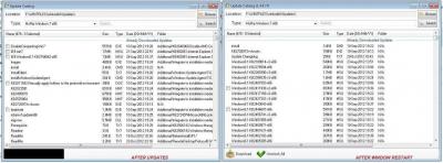
Nope! After updates download: - the tick boxes next to updates on the list are gone and only become visible when I click on an update. However, even if I tick the box, I don't see the acual tick in the box - the box stays blank. Not sure if that's a bug or software knowing I already downloaded this file. - the black bar stays black. I blindly clicked where I thought Check button would be and when I click it, the bar only gets a few pixels shorter. If I click it again, the bar goes back to previous length. However, the check button does not affect tick boxes on the list, they stay invisible. - closing and starting the Updates Catalog window results in buttons being visible but the tick boxes are still invisible. Before and After picture below.
-
Update list while updating, black bar(s)
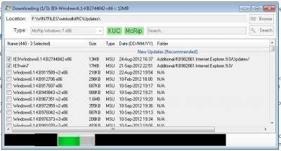
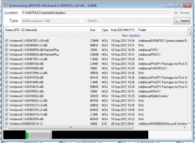
So, this is what happens when I'm downloading updates: - the number of updates to download properly counts down - the list (of updates) appears to be moving down.. ok but what that indicates? Because.. - the sidebar stays on top and is the same size as if I was just watching the list, not downloading. It's not moving or anything. It would make sense if the bar would become larger and larger as there would be less files (for downloading) to list (see above). - if I leave Win Toolkit window during this process to focus on some other window (browser, in my case) for a very short amount of time - 5 seconds or so- and come back, I am welcomed by the these black bars where Start/cancel buttons used to be and can only see the progress bar. Now I assume a) if I clicked where I think a button would be chances are it may work - I'll try this when I'm done downloading, don't want to stop/cancel whatever I'm doing just to see if the thing in pitch black works; chances are and I'll confirm it later, that when the download is done, all buttons will show back up. For the usual reference, using latest version of Win Toolkit, Win7x64 Ultimate with all updates, .NETs etc.
-
Sort By.. option under updates
I'm trying to get certain updates from McRip using the Update Catalog and would like to get the let's say the ones in the span of the last 20 days. I was wondering if it's possible to add an option that would sort files according to name/date/size and so on, you know, like in Windows Explorer? That might be pretty neat. It's nothing huge but spares me time going through whole 450+ updates list to find the ones I want. Cheers
-
GDism ELDI Java and .NET
Sweet, I'll try out this tool and if time allows me I'll make a Slovenian translation (it appears I'm the only one from my region - except for fellow neighbor NIM). Instead of making a new post I'll just edit this one and add things I like/don't like/noticed: - I'm using portable version and noticed same bug as a fella earlier - not all buttons appear to be translated (I use English language, untranslated buttons are on the pop-ups such as under About and Options). But overall, this looks really nice
-
No SP2 for Windows 7
Ah, gotcha. Thanks for clarifying
View in the app
A better way to browse. Learn more.
_14e30a.png)
_8126ce.png)


