Jump to content

Search the Community

Showing results for tags 'Main Screen'.

  • Search By Tags

    Type tags separated by commas.
  • Search By Author

Content Type


Forums

  • General
    • Announcements
    • General Discussion
    • Introduction
  • WinCert Member Projects
    • Win Toolkit
    • HeiDoc.net Projects
    • Windows Post-Install Wizard (WPI)
    • WPI, nLite and RVM Addons
    • DX WinNT6.x True Integrator
    • Switchless installers
    • XP Theme Source Patcher
    • OS Transformation Packs
    • Installer Repacks
  • WinCert.net International
    • WinCert.net Turkish
    • WinCert.net Italian
    • WinCert.net French
    • WinCert.net Spanish
    • WinCert.net Dutch
    • WinCert.net German
  • Microsoft Operating Systems and Software
    • Microsoft Windows
    • Microsoft Windows Server Family
    • Microsoft Office
    • Tips and Tricks
  • News, Support, Discussion
    • Software Field
    • Hardware Field
    • Networks and Security Field
    • Games Hangout
    • Scripting and Programming
    • Drivers Field
  • The Design Art Forum
    • Graphics Showcase
    • Windows Customization
    • Web Design/Hosting/Administering
  • Miscellaneous
    • Site and Forum Issues

Find results in...

Find results that contain...


Date Created

  • Start

    End


Last Updated

  • Start

    End


Filter by number of...

Joined

  • Start

    End


Group


AIM


MSN


Website URL


ICQ


Yahoo


Jabber


Skype


Location


Interests

Found 1 result

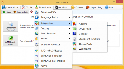
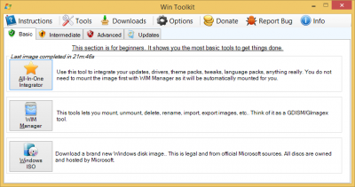
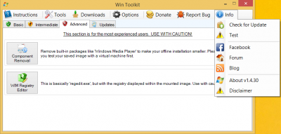
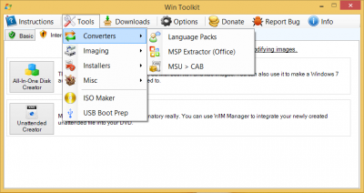
  1. In the latest test there is a new interface for the main form. The current one in v1.4.29 feels a bit outdated and has a lot of empty space so I thought I would redesign it. The new interface now looks more sleek and much more modern. Downloads and Tools have their own menu which allowed me to add a few more things. New icons, new layout, and just a new feel in general. Welcome I've removed the welcome tab and have made it a popup which will appear on the first load of WinToolkit. I've also made some changes to allow users access to guides and so on on that screen. Main You will see less tab pages but you will still see the Basic, Intermediate, Advanced and Updates sections. They have been made a bit bigger to fill in the white space but all I have to do is have more descriptions. Tools and Downloads The tabs which have all the tools and Downloads have been moved to their own menus. This allowed me to add more links now and also in the future. Each item has a tooltip so you can get an idea of what each one does. Menu Check for updates, links to blogs and the change log have been moved to the Info menu. This helps reduce clutter. Any Questions?
×
×
  • Create New...