Search the Community
Showing results for tags 'WinToolkit 1.4.0.51'.
-
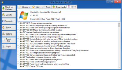
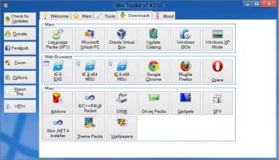
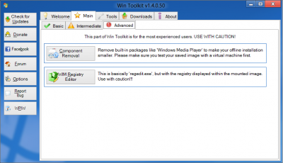
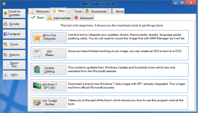
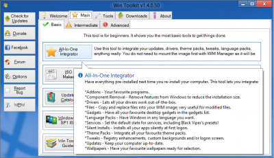
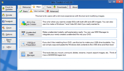
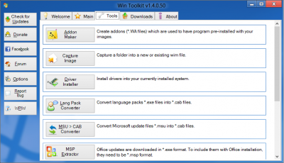
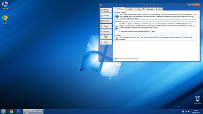
In v51 (next release) you will see a new main menu design. The changes I have made will hopefully allow beginners to see what each tool does whilst making the tool looking more professional. It looks great on Windows 8 and I have listened to users feedback about the design to make sure it's clean, sleek and less cluttered. The first thing you will notice is that all of the buttons are smaller as they are now 32x32 instead of 64x64, which has also allowed a smaller WinToolkit.exe filesize. Below i will go into detail of what has changed in each page. I've also changed some tooltip settings which will hopefully improve things. Welcome The welcome screen was initially just one big text box, but i've now separated each part of the text into their own box. This allows the user to see information easier and it also matches with the rest of the new look on the other pages. You will also notice a new 'Report Bug' button which allows users to report bugs much more quicker and easier but most importantly removes the confusion of where to post issues. To make things easier, this button will NOT go through 'adf.ly' links. Main As you can see now there centered text at top giving a quick description about that page in general. As mentioned above the icons are a lot smaller but the biggest change you will see is a short description about the tool next to each button which will help beginners. When you put your mouse over a button it will glow a light blue and will also show a tooltip with more detail about what that tool does. You will also notice that All-In-One Disk Creator has now been moved to the 'Intermediate' tab. Tools Tools has had a similar makeover as the 'Main' tab. You can easily scroll up and down to see the other tools. Downloads The 'Downloads' tab looks a lot tidier, especially with smaller icons. About Smaller image and the text is not bolded. Download Feel free to download the test version and leave feedback. http://wincert.net/leli55PK/Testing/
- 80 replies
-
- WinToolkit 1.4.0.51
- New Design
-
(and 1 more)
Tagged with:


